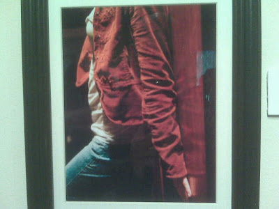
The first piece is a photograph of a woman leaning up against the wall, and is entitled The "Hiding Places." The reason that I chose this piece is that it's title really matches the picture. It really looks like the girl is trying to find some place where she can be a little more out of the spotlight, and kind of be in the background. Her problem is that there is nowhere to hide. So the only thing she can do is push herself up against the wall. I can relate to these pictures because whenever I'm in a big crowd of people I don't really know, I like to try to find a place that's a little reclusive. But sometimes there is no place to really go. In class for example, I like to sit in the back, or against one of the walls, I just don't like being in the middle, with everyone watching me. I like to be more in the background.
In the photograph there is space on either side of her. On the left it is just open black space and on the right it is the wall. This kind of forces her out into the middle of the picture even though we see that she wants to be up against the wall as much as possible, so we see this struggle going on. There is a balance of space on the left because everything that's not apart of her is just negative space. The value is from indoor ceiling lights that are coming down and from the left. At the bottom right of the pic we can see a darker kind of area. I like the colors because they are in unity. The reddish maroon color of her jacket is very close to the brownish red color of the door. Her blue pants and white blouse are all part of a very simple color scheme and that brings harmony. There are really only about five colors: maroon/red jacket, brownish red door, blue jeans, white blouse, tan hand, and black space. The door and her jacket are very similar, her hand is just the color of skin, and the black is taken for granted because it's just space. So really it only seems like there is about three colors. Each object seems to have it's own color.
This piece is aesthetically pleasing to me. I really like her body position. Her back is against the wall, her leg is kind of out in order to disguise the fact that she is trying to get as close to the wall as possible, and her arm and hand are stuck flat against the wall. I think that the pic shows a good balance of light and shadow. The shadow doesn't make it look dark or dingy. I also like the color scheme.
What the author is trying to get across seems kind of obvious based on the content and title of the piece. Sometimes when people who are more shy or introverted are put in a group setting, we tend to try to find somewhere to hide, even when there really is no place. We might look good, and there is no real reason for us to be uncomfortable or ashamed, but we just like to be a little incognito.
The second piece is an advertisement for a bar of soap. The reaon I chose it was because it looks very old school and classic. The shape of the soap is octagonal is unique. The "Lifebuoy" name that is skethed into the soap looks like writing you would have found about fifty years ago or more. The package for the soap and the tan background color are faded and classic looking.
There is a harmony amoung the color scheme. The tan and greens are faded and soft. There is an emphasis on the soap because it is the darkest color and it takes prominence at the bottom of the page. The top is just a title and the middle describes it, but my eyes immediately go the the soap.
The ad is aesthetically pleasing to me because it looks kind of old school and it is simple and the color scheme is in harmony. I also think that the artist did a very good job in scanning the picture of the soap and the soap package into the piece. It looks more like a photgraph of the soap, but I know there was more to it than that.
I think that the intention of the ad is to say choose the good old soap, it has been getting things clean since the time of your grandparents. You know that you can trust this soap, and all other soaps are just cheap knock offs. They are just normal rectangular shaped soap, they don't have the value of being cool octangular soap. It almost has a similar feel to that of old spice deodorant. This is like the official soap.


excellent job on the element analysis abe!!!! your use of the elements really shows your command of how artwork is made. well done!
ReplyDelete-evelyn davis, professor